Reproducing the Digital Stopwatch Interface, Part 3
Adding the List
We're almost done! 😎
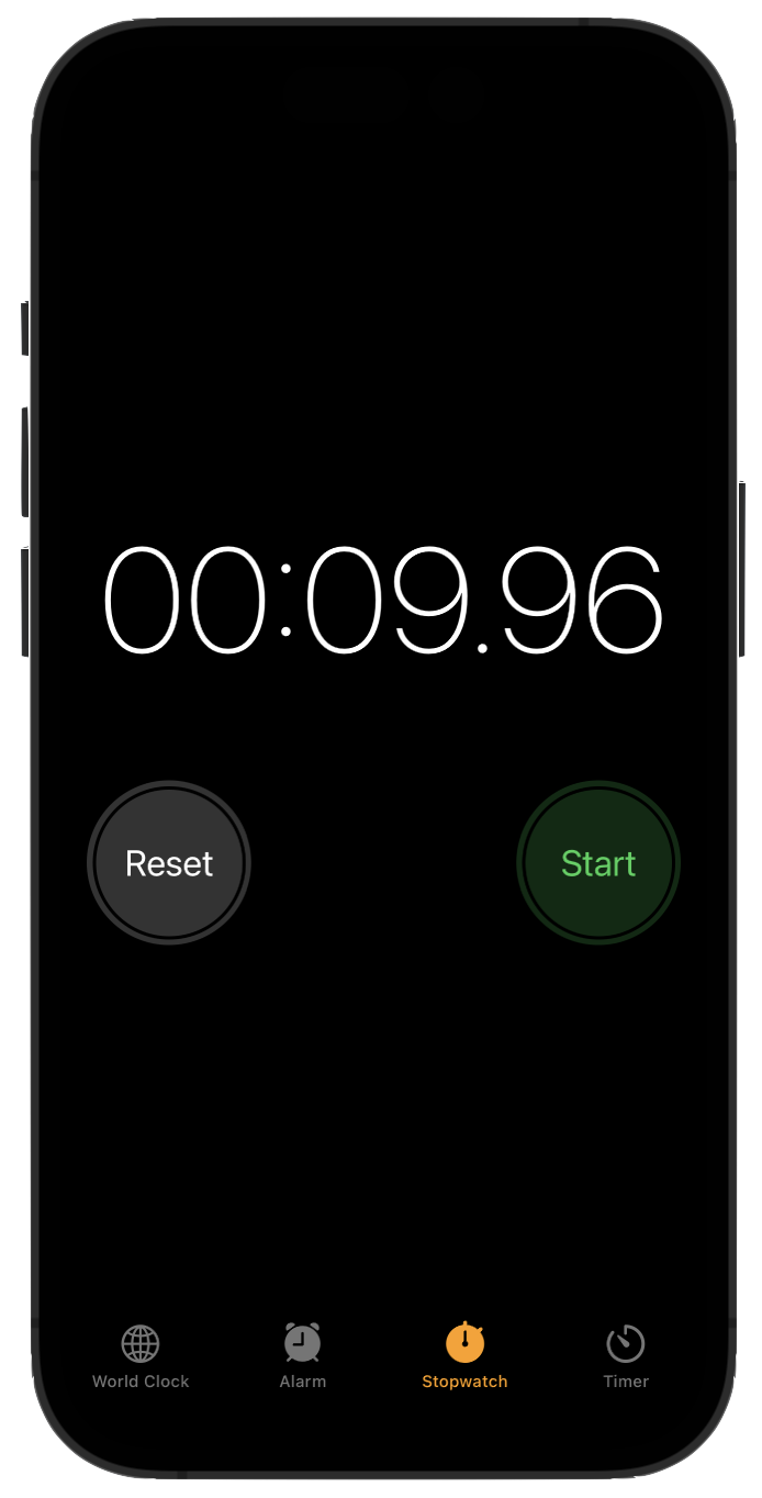
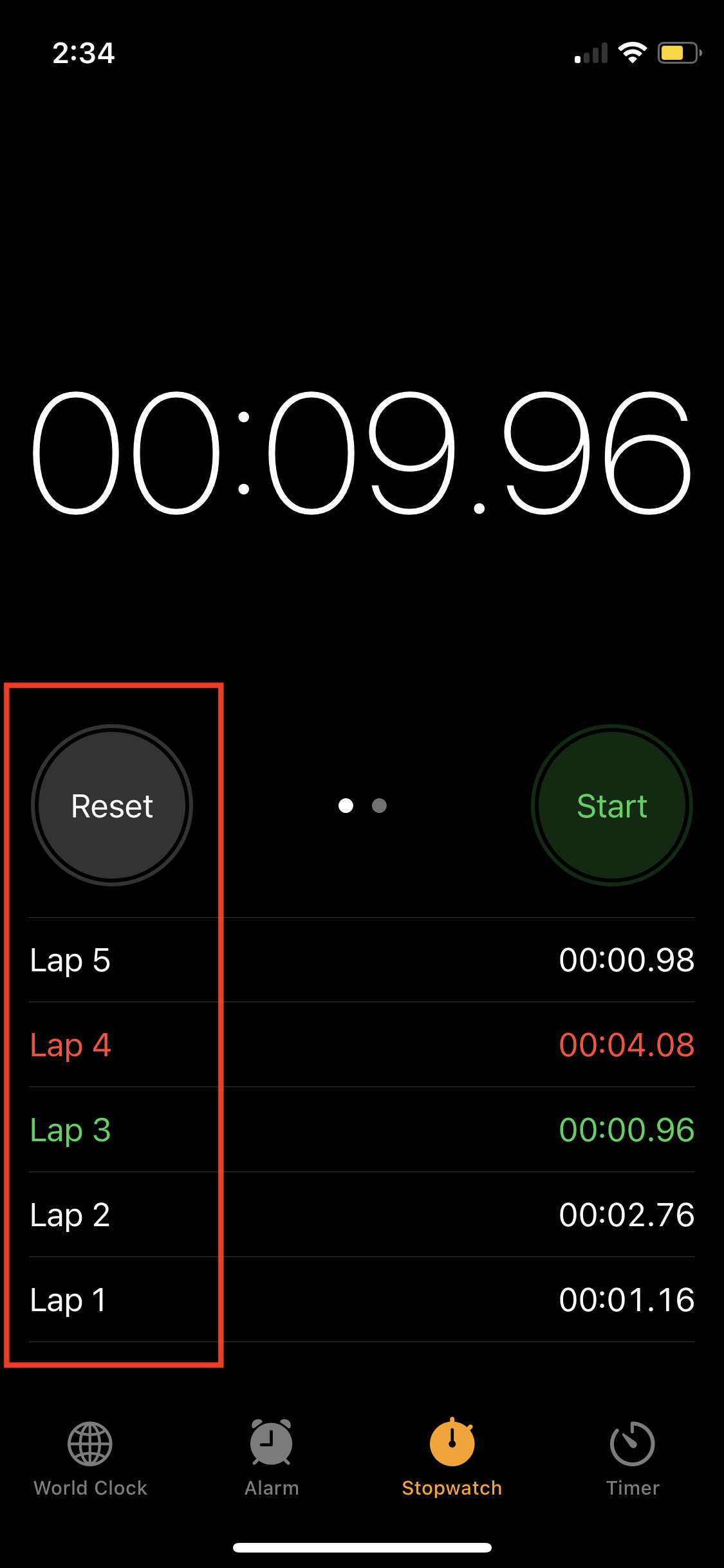
Here is our goal:
All that is left is to create the list.
Lists can adopt many appearances on iOS. This article by Peter Freise provides an outstanding set of examples on how to format a list.
Bookmark Peter's article for future reference.
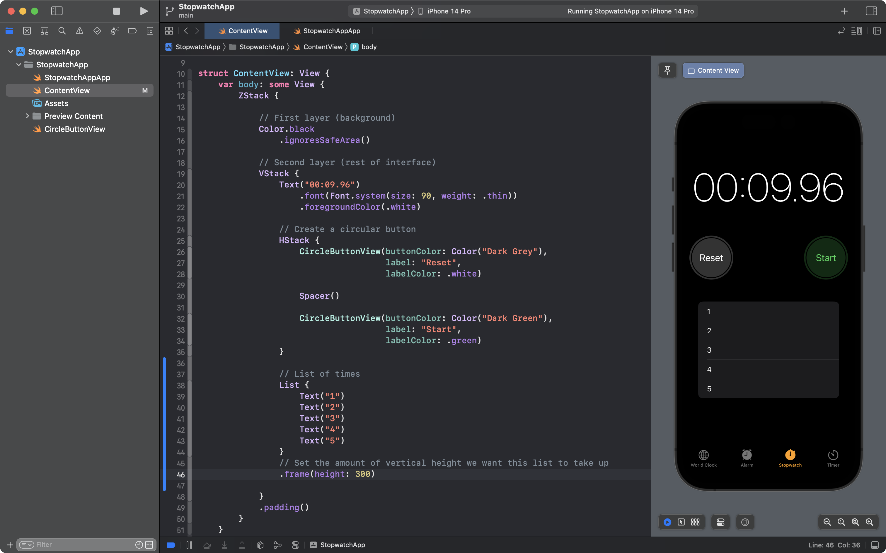
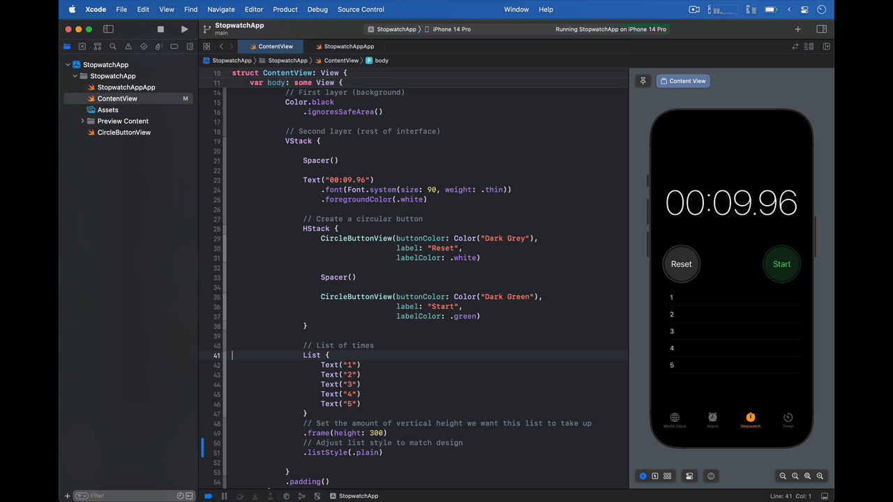
Let's get started on our list. Scroll up to the top of ContentView:
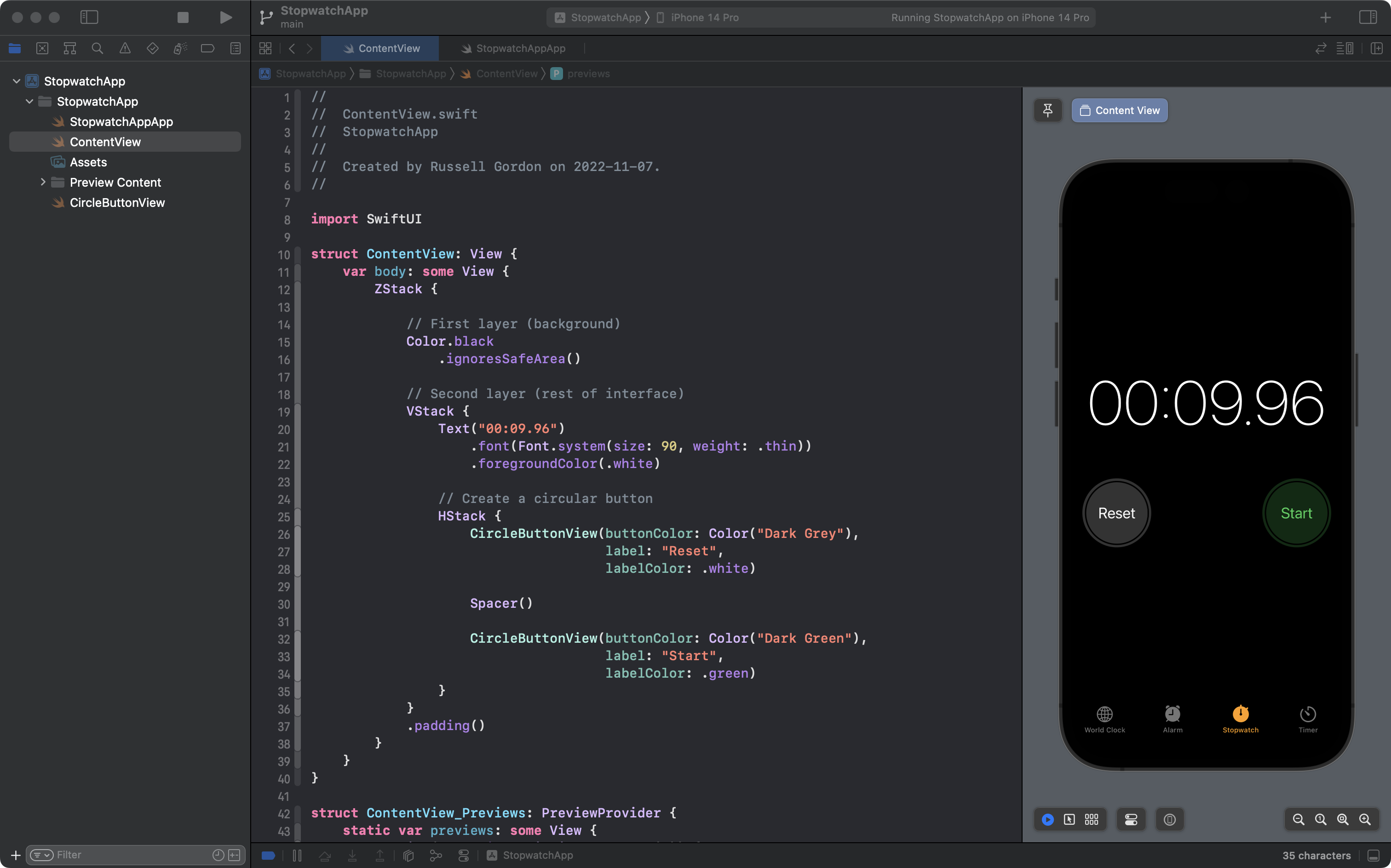
Then add the basic structure of a list with five entries, like this:
You will notice that the list immediately pushs the rest of the content up to the top of the screen.
That is because a list naturally expands, vertically, to take up all available space, regardless of how many list items it contains.
We want the list to take up only a portion of the space available, so, add a .frame view modifier, like this, on lines 45 and 46:
That helps a bit, but the interface still does not quite match our goal:
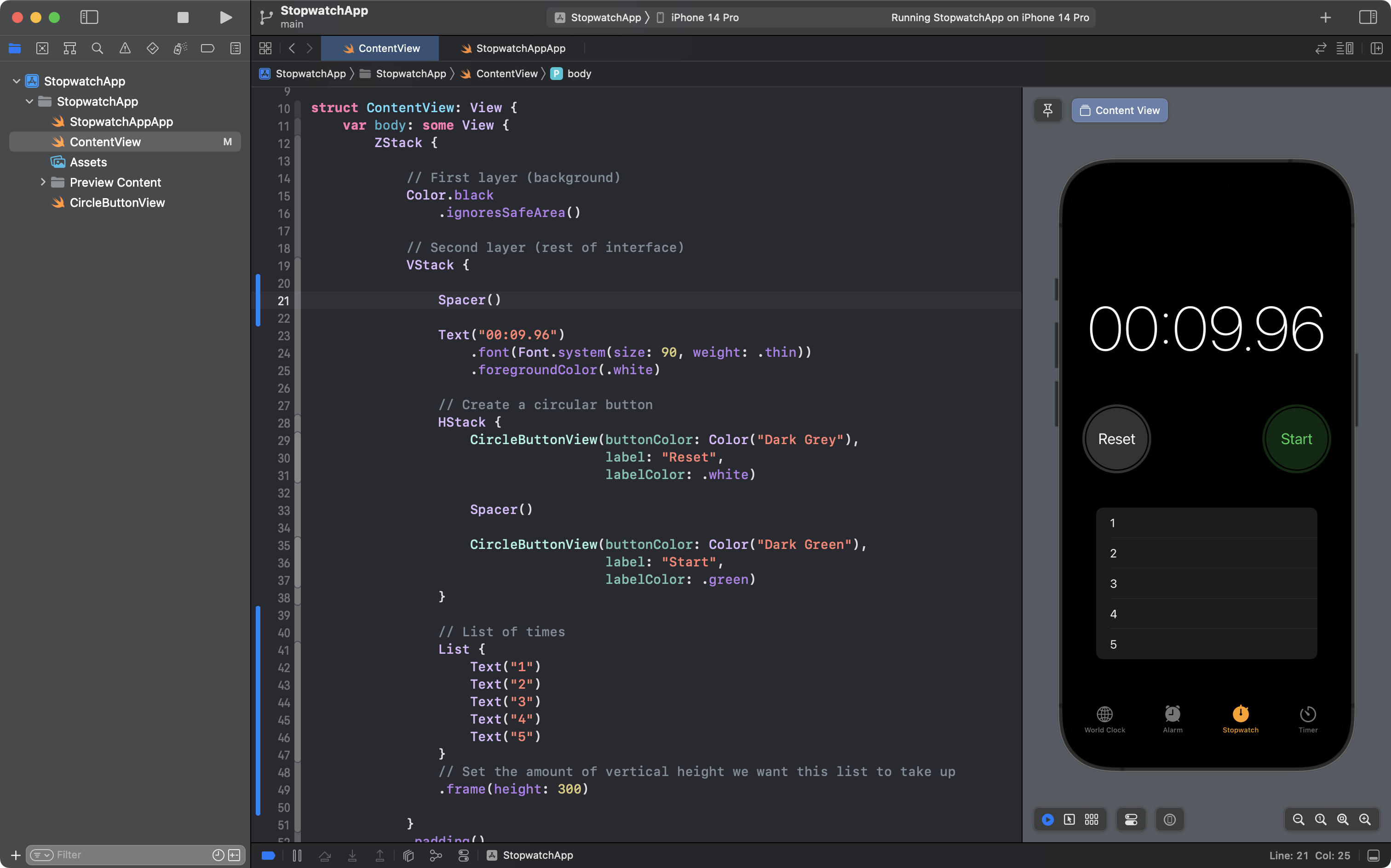
This is a case where a Spacer structure is helpful. Add one above the Text view, inside the VStack:
This is pretty good – we still have some work to do – but let's commit and push at this point, with the following message:
Added a simple list and made the position of user interface elements mostly match the goal.
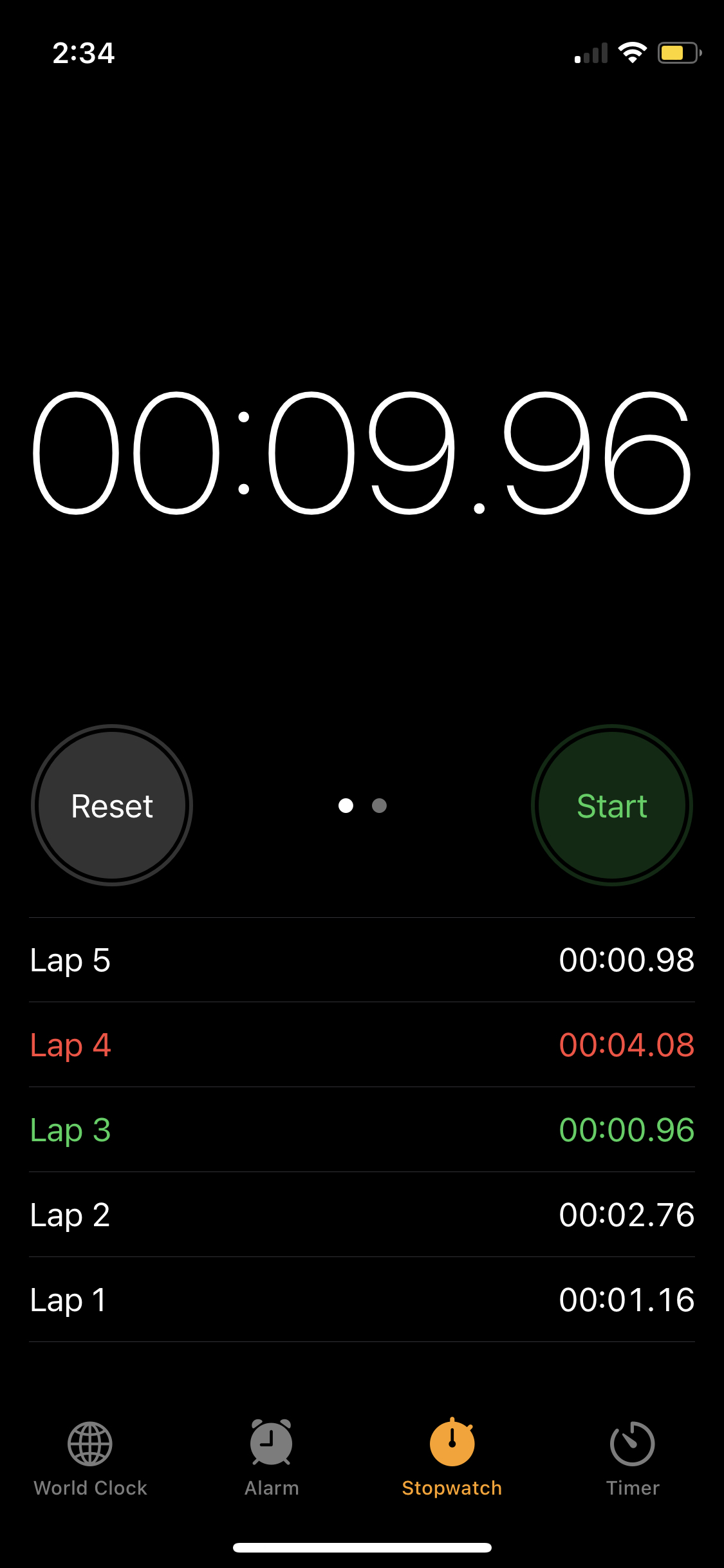
Now, compared to the goal:
... you can see that the visual appearance of our list does not match the goal – our list is rounded, whereas the target list is more square.
If you consult Peter Friese's article on formatting list views, you might see what we need to do:
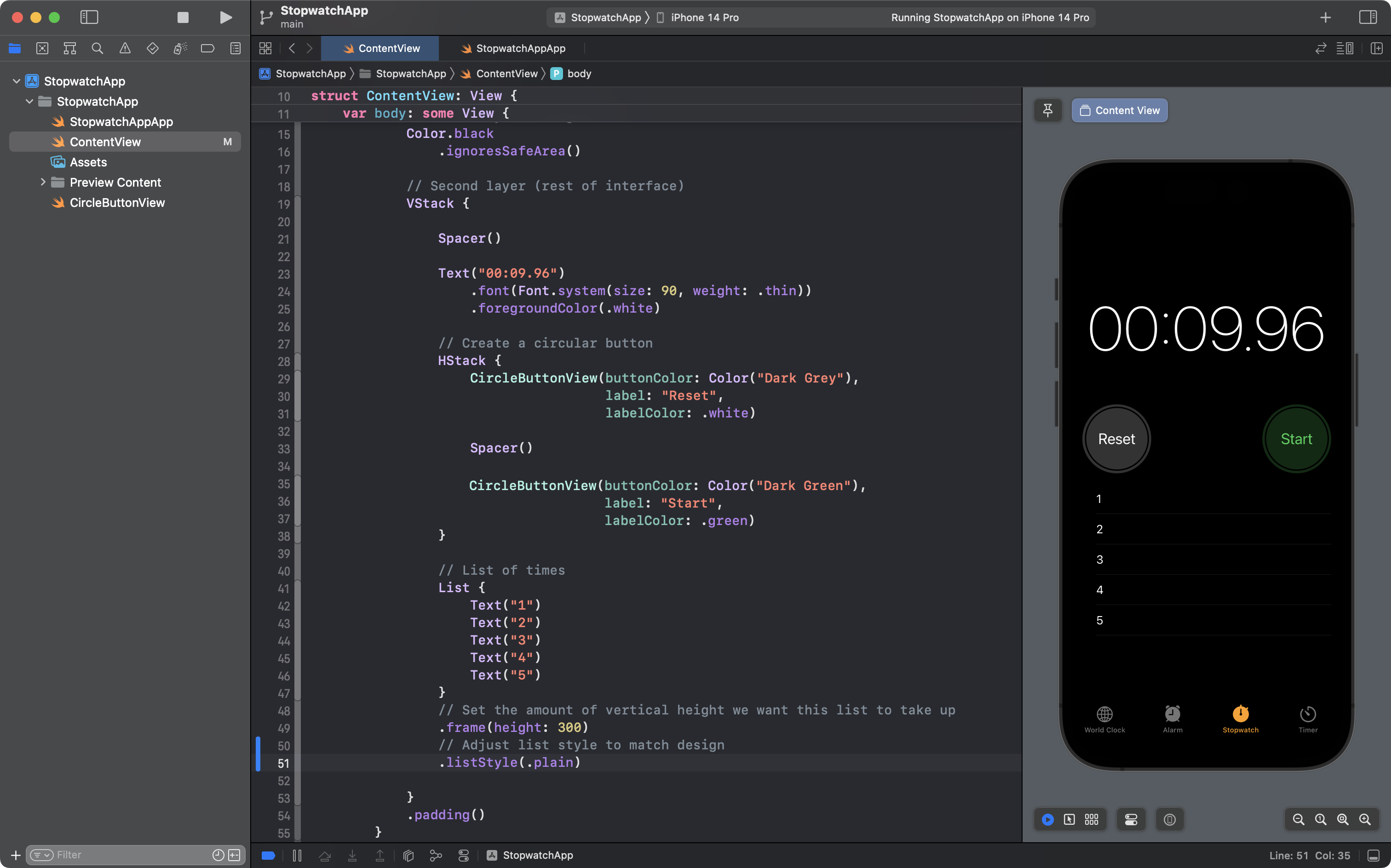
Add the .listStyle modifier as shown above on lines 50 and 51. This is progress.
If you look very closely, however, you might notice that the inset of the text for each list item is a bit off:
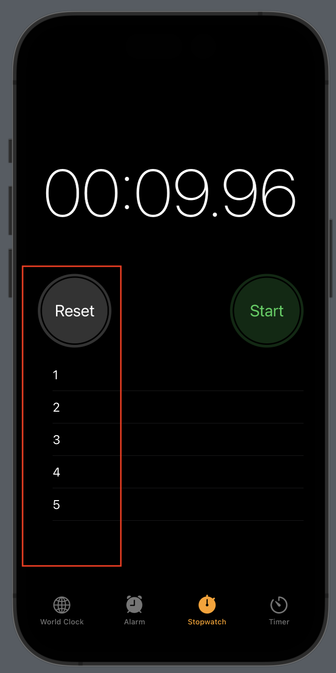
Notice how our list items are just a bit further to the right of the leading edge the Reset button, as compared to the goal:
That can be fixed by adjusting the list items themselves.
We need to apply a view modifier to all the list items, but not to the List structure itself.
To do this, we can add a Group structure around the list items:
Now we can attach a view modifier to the Group structure, as shown here on lines 50 and 51:
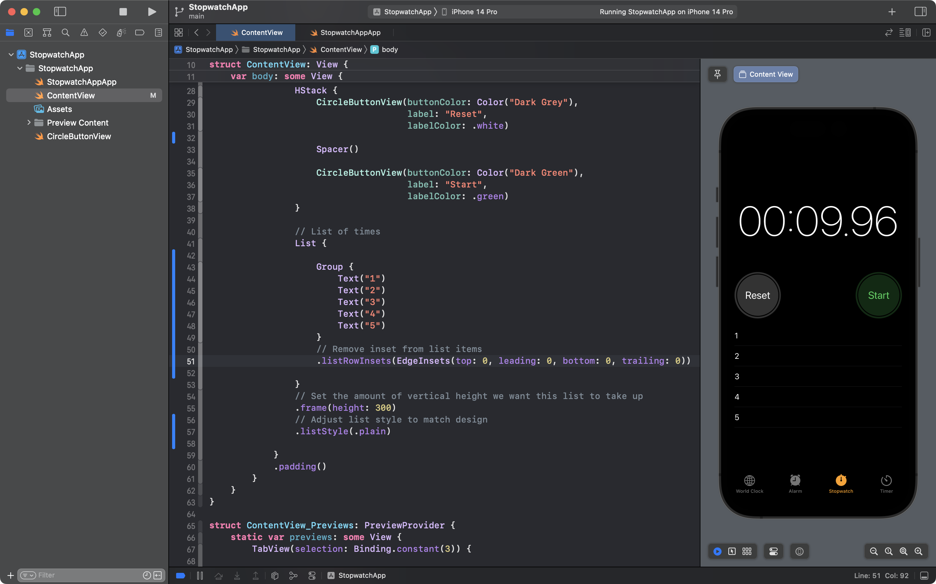
The view modifier will be applied to all the structures that are part of the group – all five Text views in this case.
As a result, the inset of the list items is now 0 on all sides – leading, trailing, top, and bottom.
This is great progress – our app better matches the goal.
So, save your work now by committing and pushing with this message:
Made list style better match our goal; also adjusted list item insets.
Mini-Exercise: Complete the list
The list in the current version of our app:
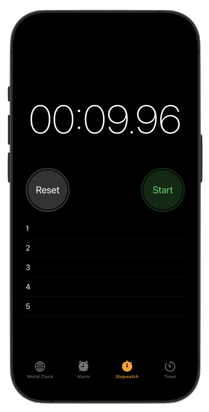
... is very close to matching the goal:
You can probably identify a few things that are not quite right:
- text size of a list item
- vertical height of a list item
- tint, or color, of the separator between rows in the list
- some list items need to be a different color
Of course, the list items themselves are also not showing the correct information yet:
- the lap number
- how long that lap took
Using the understanding you have developed in this lesson and earlier lessons – and resources like this one on how to style lists – finish the interface – make your app's visual appearance match the goal.
Consider writing a custom structure to represent a list item – will that help you to avoid writing repetitive code?