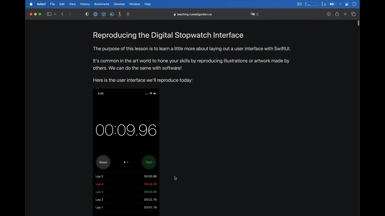
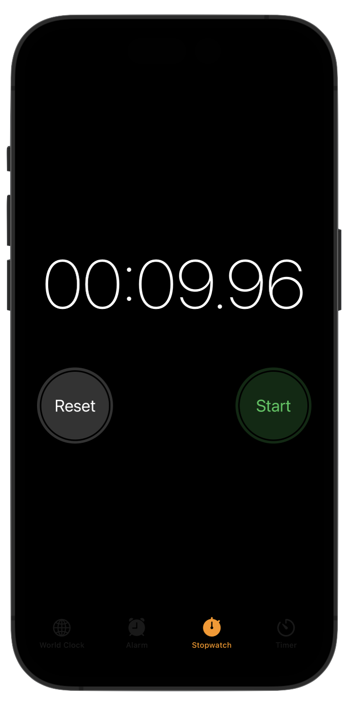
Reproducing the Digital Stopwatch Interface, Part 2
Fixing the Colors
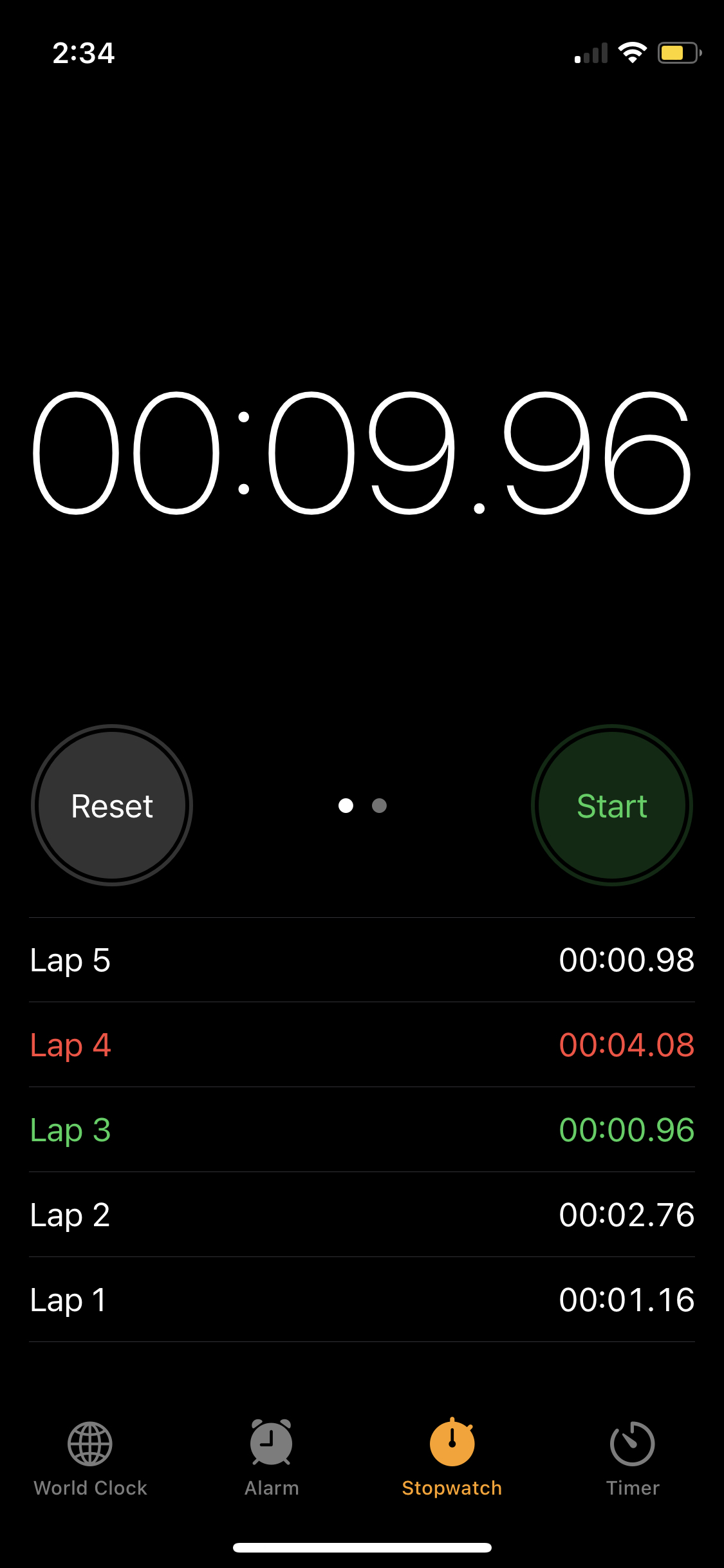
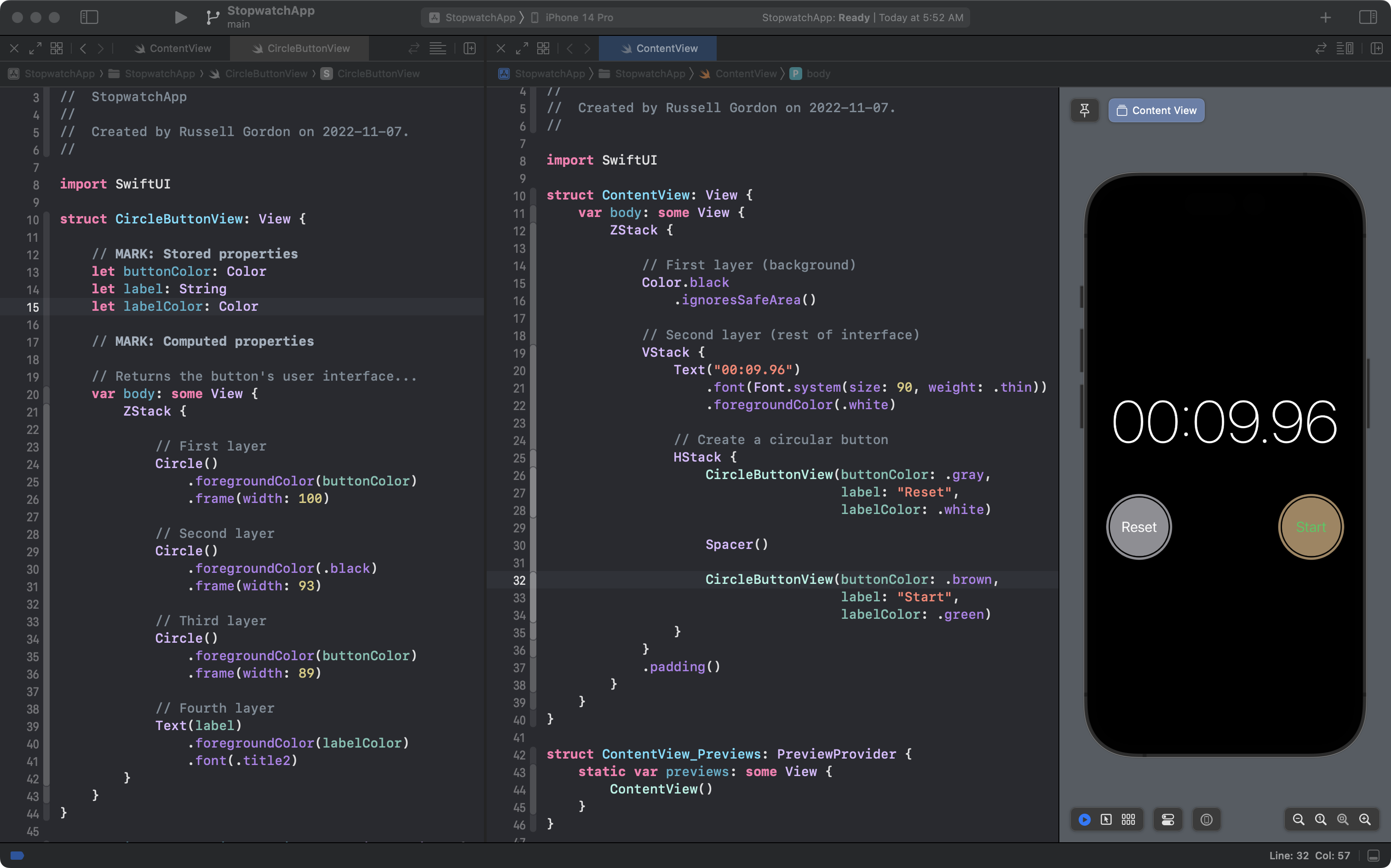
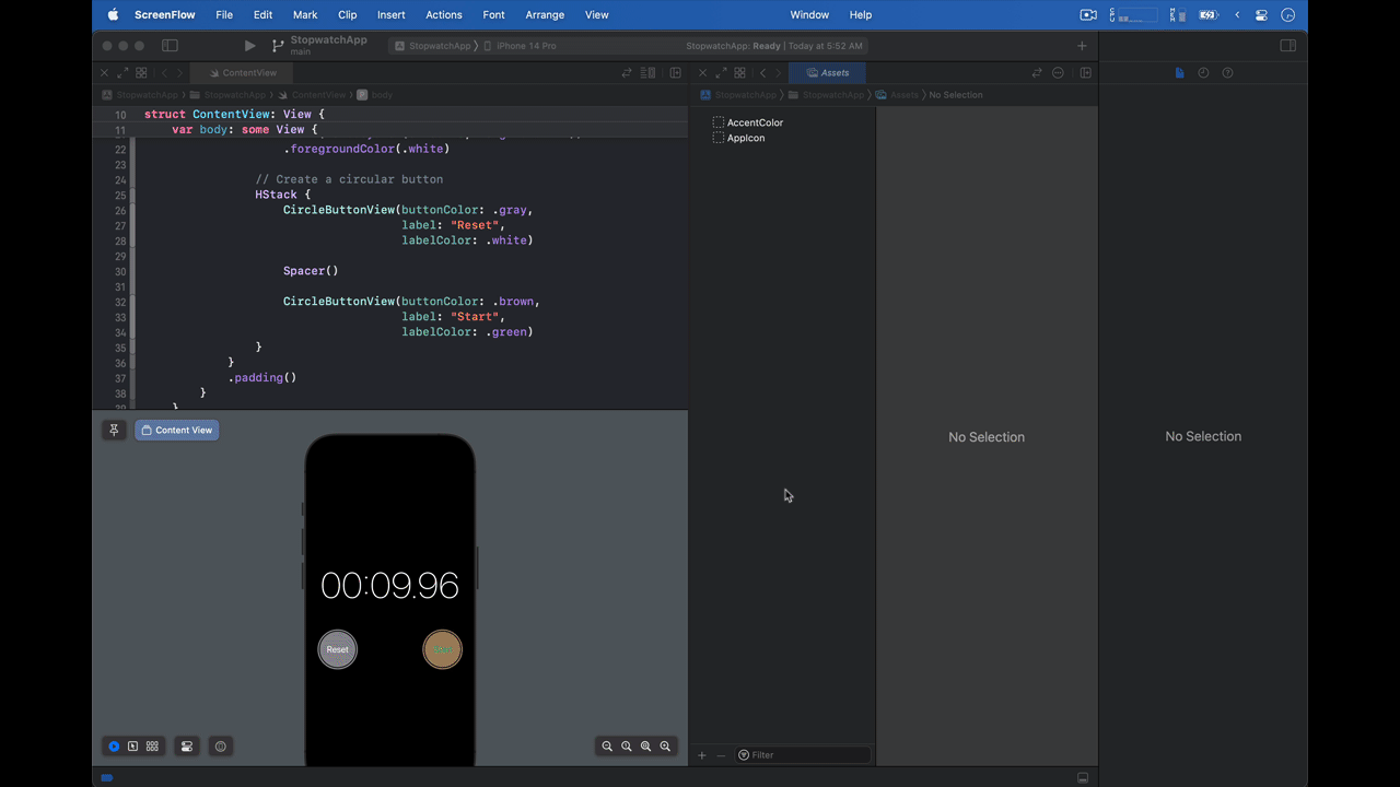
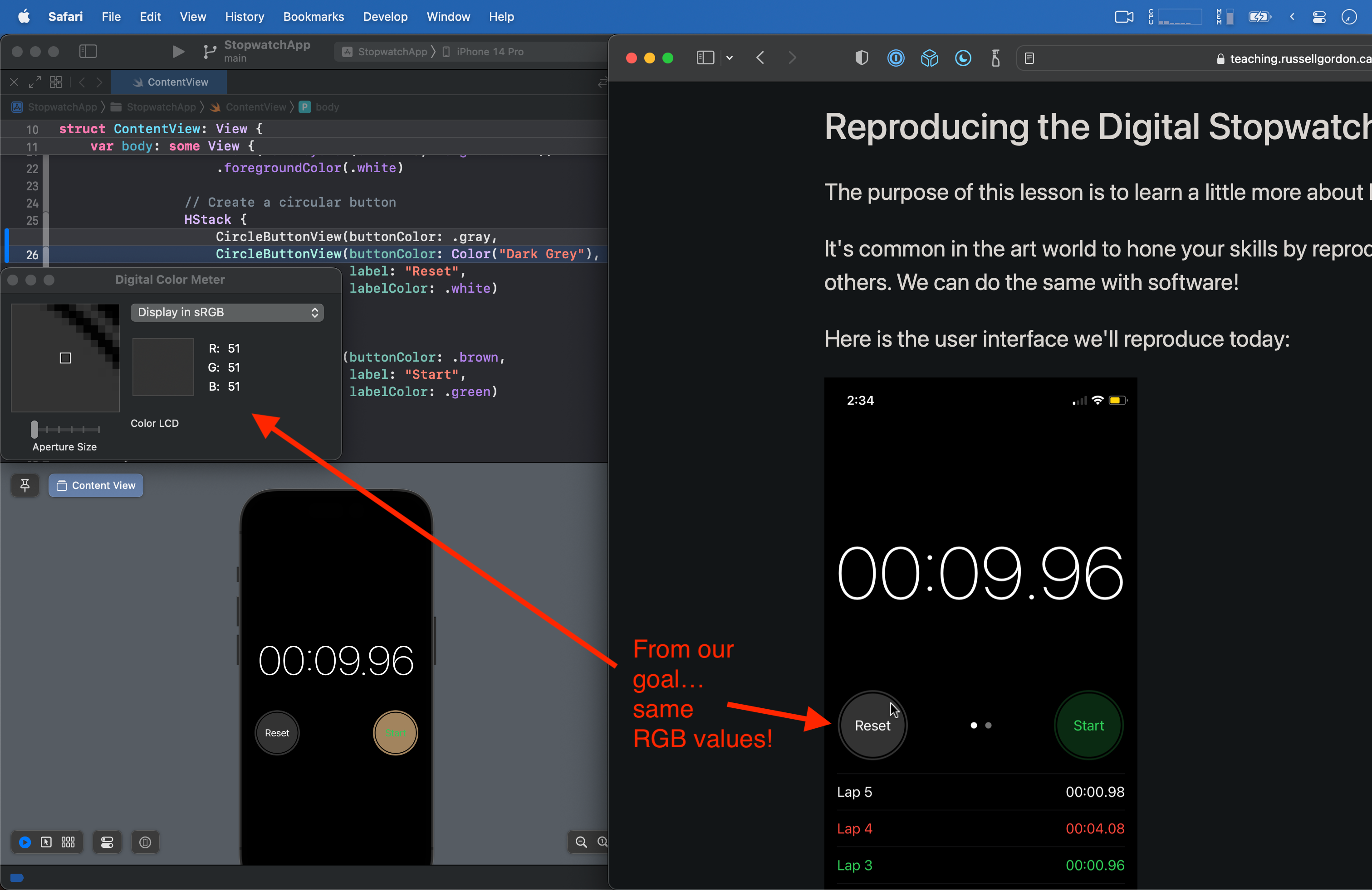
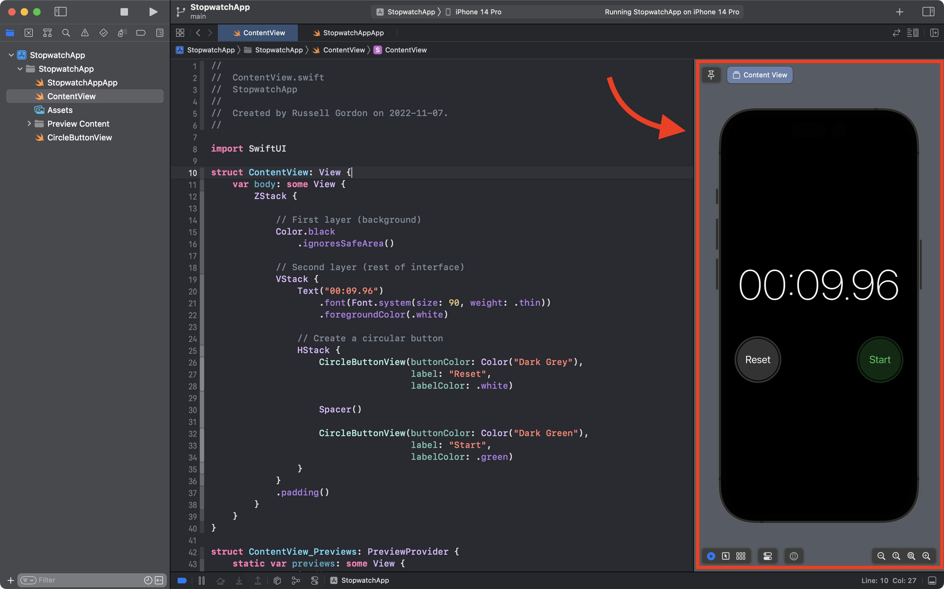
We've made great progress:
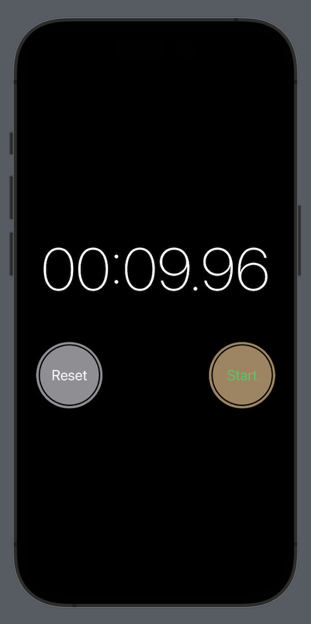
... but the colors of the buttons don't match our goal:
Let's fix that now.
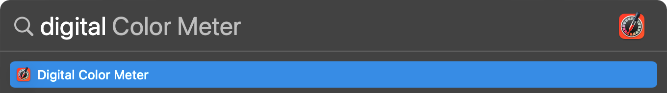
Press Command-Spacebar to open the Spotlight search bar:

Then type:
digital
...and the first suggestion should be an app named Digital Color Meter:
Press the Return key and the application will open:
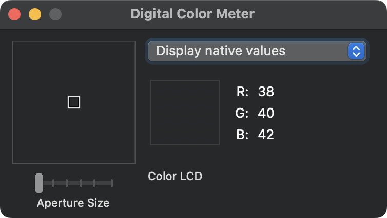
As you move the mouse cursor around the user interface on your computer, the app will tell you the color values of the pixel that is right underneath your mouse cursor.
How computers describe color could be a topic for an entire course!
Here is a brief explanation.
Digital Color Meter defaults to describing colours with three channels – red, green, and blue.
For example, if a color has 0 for it's red channel, 0 for it's green channel, and 0 for it's blue channel, then you will have black.
For short, we would say that black has RGB values of 0, 0, 0.
Each color channel in RGB is an 8-bit value (more on what a bit is later in this course).
For now, know that 8 bits allows for a number between 0 and 255 to be represented.
So, what color would have RGB values of 255, 255, 255?
If you guessed "white", you are correct.
Every other color is some other combination of RGB values.
For example, a shade of purple has RGB values of 166, 128, 223.
So, we are going to:
- Use Digital Color Meter to find the RGB values for the buttons from the interface we are trying to reproduce.
- Create a custom color set in Xcode to duplicate that color.
- Use the custom color in our own version of the Stopwatch app.
Finding a Color
To find a color:
- Scroll to a part of this article where our goal is shown, such as the very top.
- Use the keyboard shortcut
Command-Tabto switch to Digital Color Meter. - Change the dropdown menu in Digital Color Meter so that the Display in sRGB option is shown.
- Then, hover your mouse cursor over the button on the left.
- Finally, when your mouse cursor is in the correct position, use the keyboard shortcut
Command-Lto lock Digital Color Meter so that it keeps showing the same RGB values – even after you move your cursor away to another position.
That's a lot of steps, so here's what that looks like in a short animation:
Now you know that the RGB color code for the dark grey of the button of our goal is: 51, 51, 51.
Creating a Custom Color Set
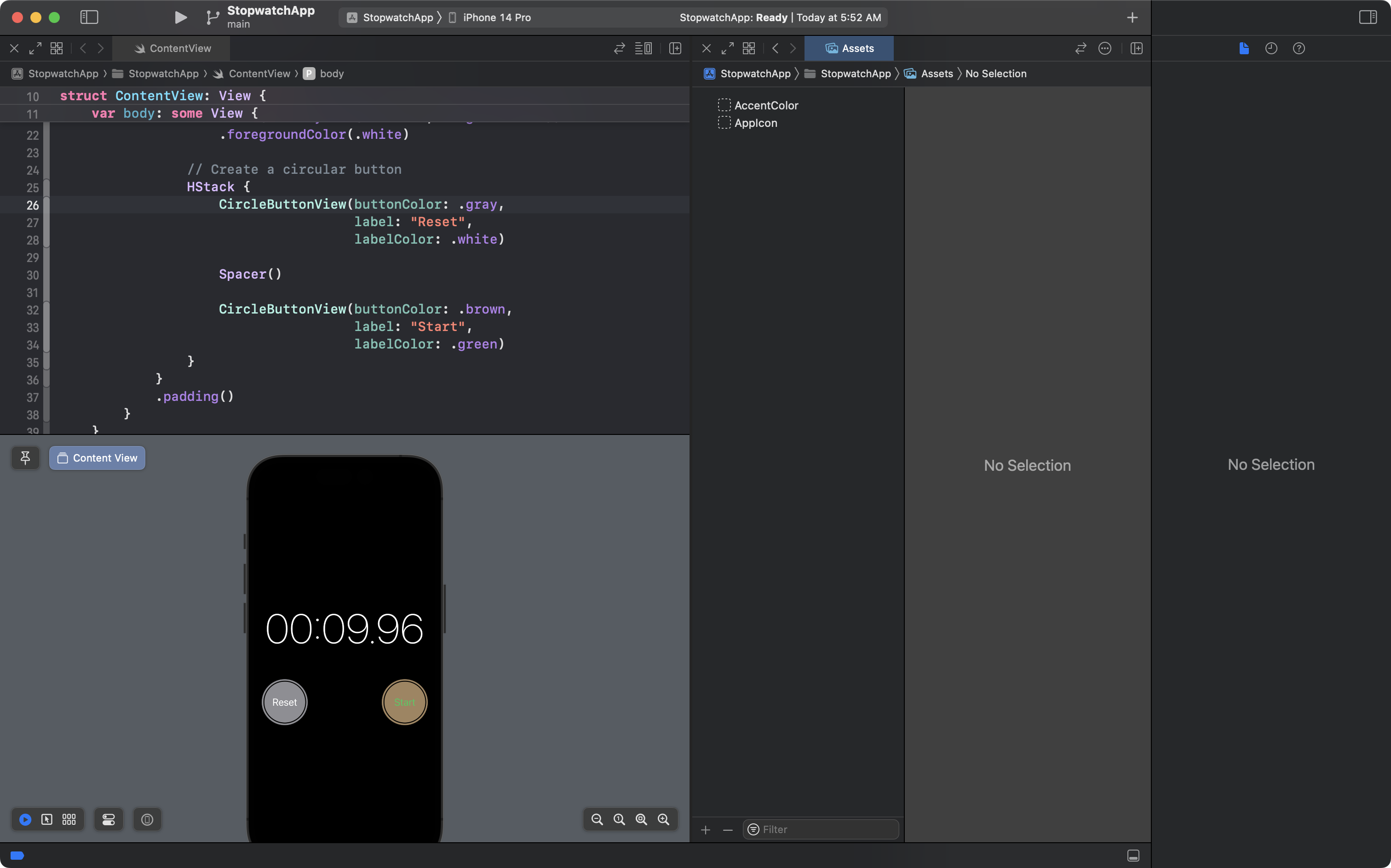
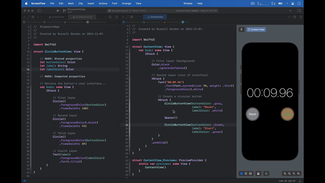
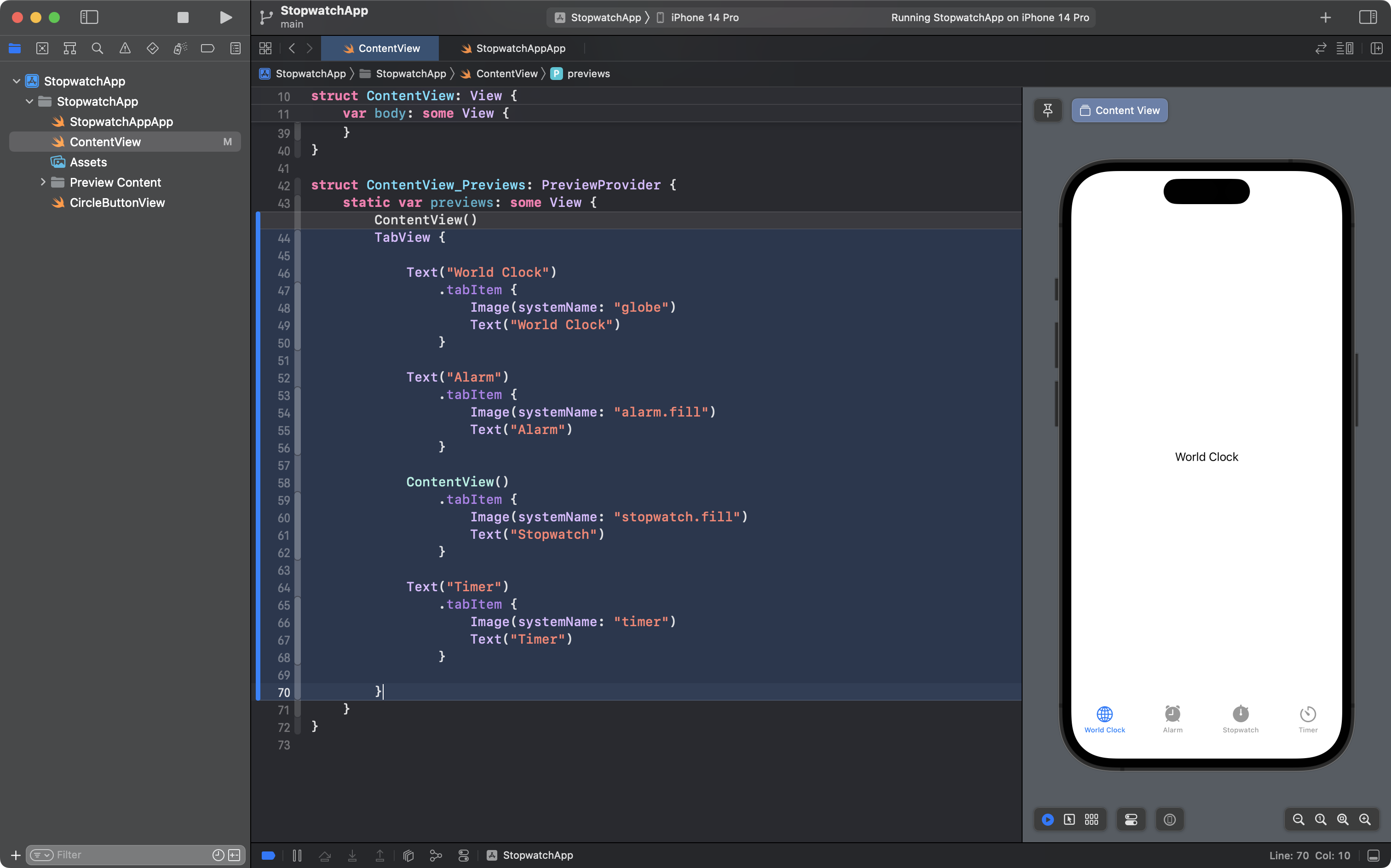
Your Xcode interface probably looks like this right now:
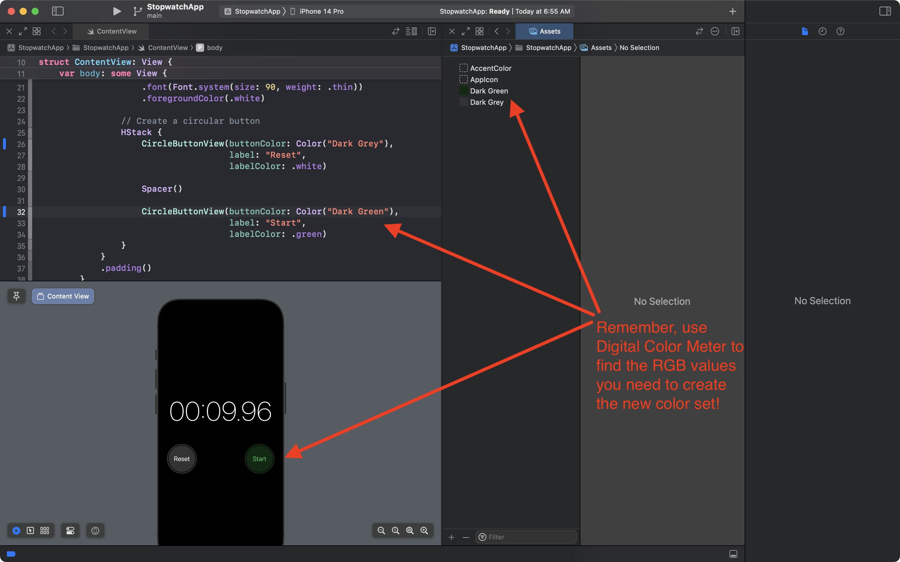
We're going to re-arrange things so that it looks like this instead – ContentView on the left, and the Assets folder for our project on the right:
Here's how to do that:
Next, we will:
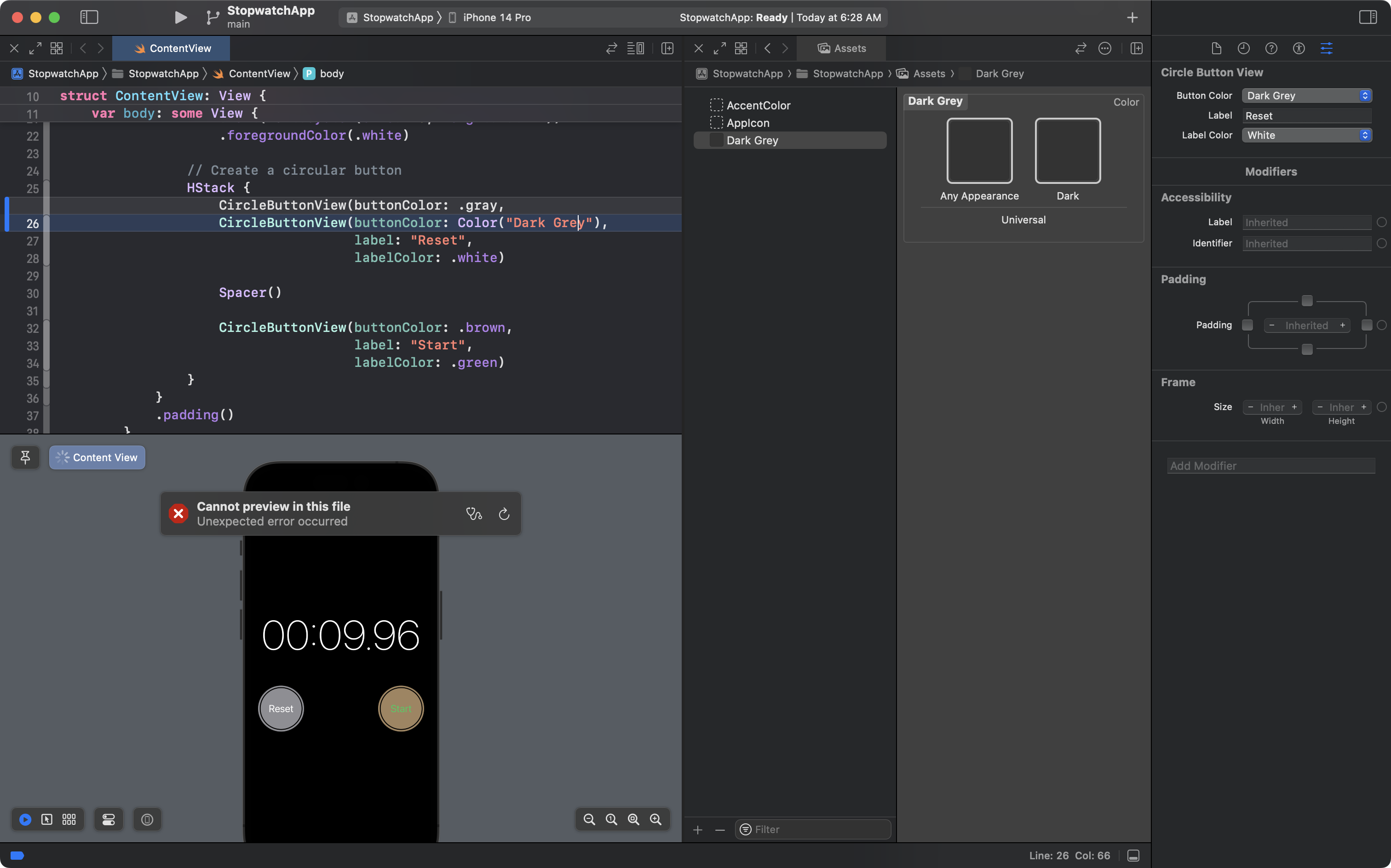
- Create the new color set named
Dark Greyin the Assets folder - Assign it the RGB values of 51, 51, and 51
- Ensure that the same color appears for this color set with any appearance on a user's device (even when the device is in dark mode)
- We do this by copying, or
Option-dragging from the color well on the left into the color well on the right
- We do this by copying, or
Here is what that looks like:
Finally, we can use the new color set that we have just defined within our project's code.
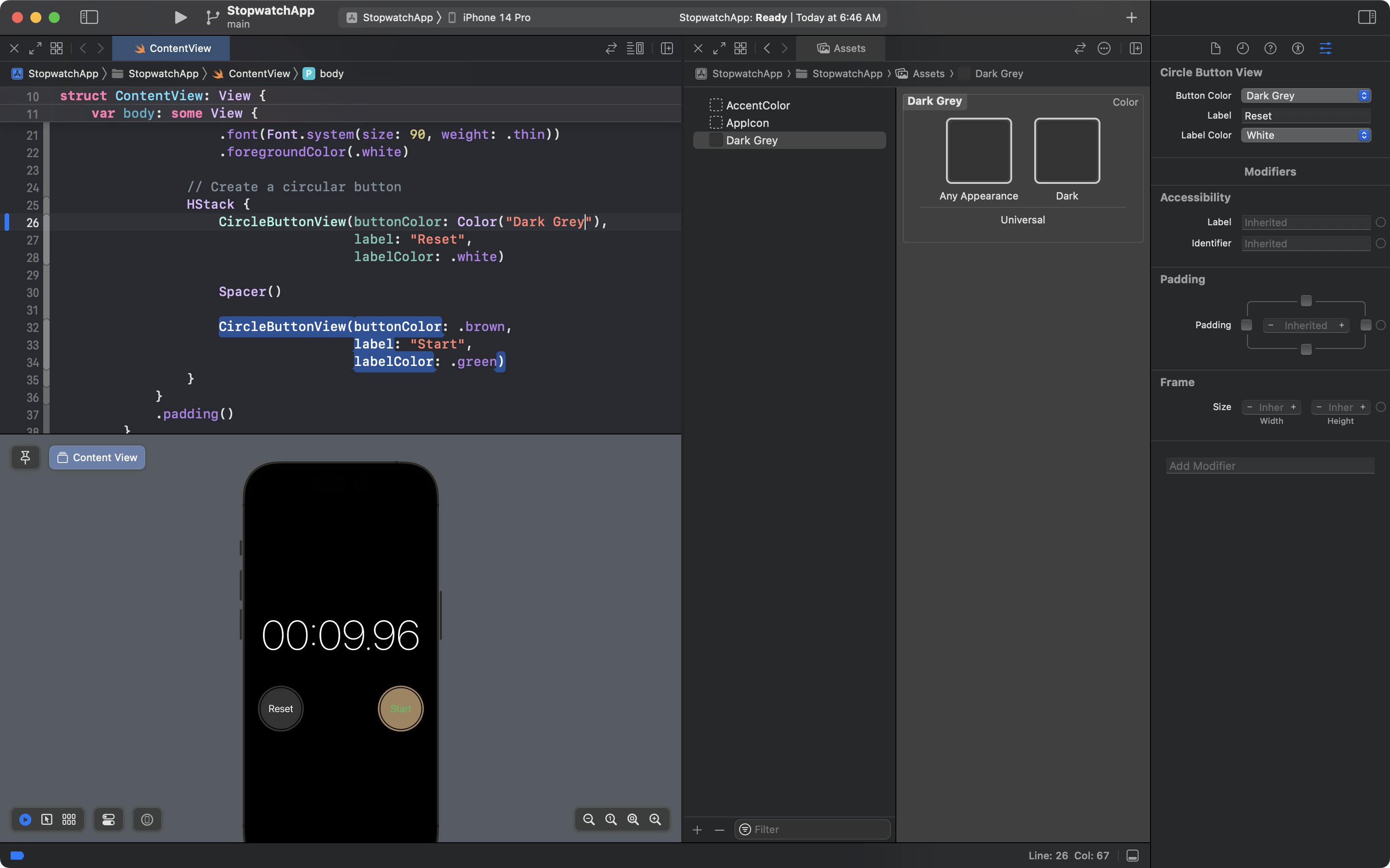
Make the following edit to ContentView – changing the argument for buttonColor from the built-in system .gray color to Color("Dark Grey"):
It's quite likely that the preview window will stop working when you change the argument to it's new value.
After making certain that the argument is Color("Dark Grey") – check for typos – you can restart the preview window using the keyboard shortcut Option-Command-P.
You will see the lefthand button now has a darker grey – that should perfectly match the dark grey of the our goal:
How can you check? Use the Digital Color Meter app, of course!
Press Command-L to unlock the value showed by Digital Color Meter and then check the RGB values for the button from our app at left:
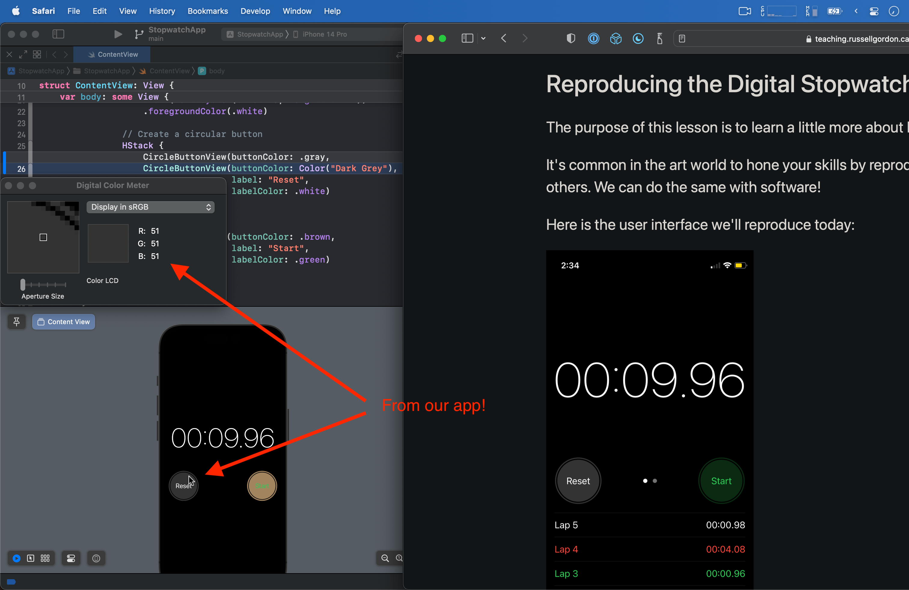
And do the same for the buttom from our goal, at right:
Mini-Exercise: Fix the other button
Now it's your turn!
Use the steps shown in the most recent section of this lesson to create another color set named Dark Green and then use it to change the color of the righthand button.
When you are done, things should look like this:
This is huge progress, and you've learned a lot about how to use Xcode to represent precise colors.
Well done!
Commit and push your work with this message:
Created and used new color sets to match buttons to our goal.
Adding the Tab Bar
The next section we'll tackle is adding the tabs at the bottom of the interface:
This is reasonably straightforward.
Tabs are created in SwiftUI using a TabView structure.
So, how does a TabView work?
To answer that question, let's revisit something you already understand – a navigation view:
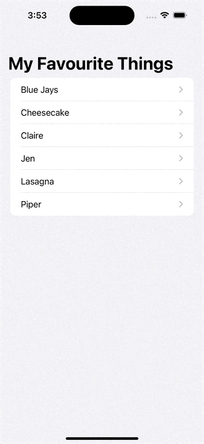
The NavigationView structure is essentially a container for moving horizontally between screens in your app:
flowchart LR

id1["App Entry Point\n(NavigationView)"] --> id2["List\n(NavigationLink)"]
id2 --> id3[Blue Jays]
id2 --> id4[Cheesecake]
id2 --> id5[Claire]
id2 --> id6[Jen]
id2 --> id7[Lasagna]
id2 --> id8[Piper]
Think of a TabView structure as a container for moving between screens in a vertical manner, since we select the new screen by tapping at the bottom of the current screen:
First we create a TabView, then we identify the structures that a user can navigate to – attaching a .tabItem view modifier to identify what image and text should appear for each option, or item, in the tab bar:
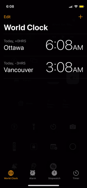
flowchart TD

id1["App Entry Point\n(TabView)"] --> id3["World Clock\n(.tabItem)"]
id1 --> id4["Alarm\n(.tabItem)"]
id1 --> id5["Stopwatch\n(.tabItem)"]
id1 --> id6["Timer\n(.tabItem)"]
This is generally how a TabView is used when authoring a finished app – you would place the TabView in the app entry point file:
Don't actually make this edit in your project yet – we're going to put the TabView somewhere else in a moment.
After modifying the code in the app entry point file, when you launch your program in the Simulator:
... you would see a tab bar that allows for movement between four screens, only one of which is actually implemented – the other three simply show a Text view as a placeholder:
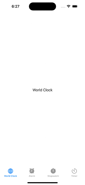
Now, as you can see, that implementation is not complete:
- background colors are wrong (white, not black)
- tab item accent colors are wrong (blue, not orange)
Those issues are easily fixed.
As well, for this lesson, we'll stick to using the Xcode Previews window to see the tab bar:
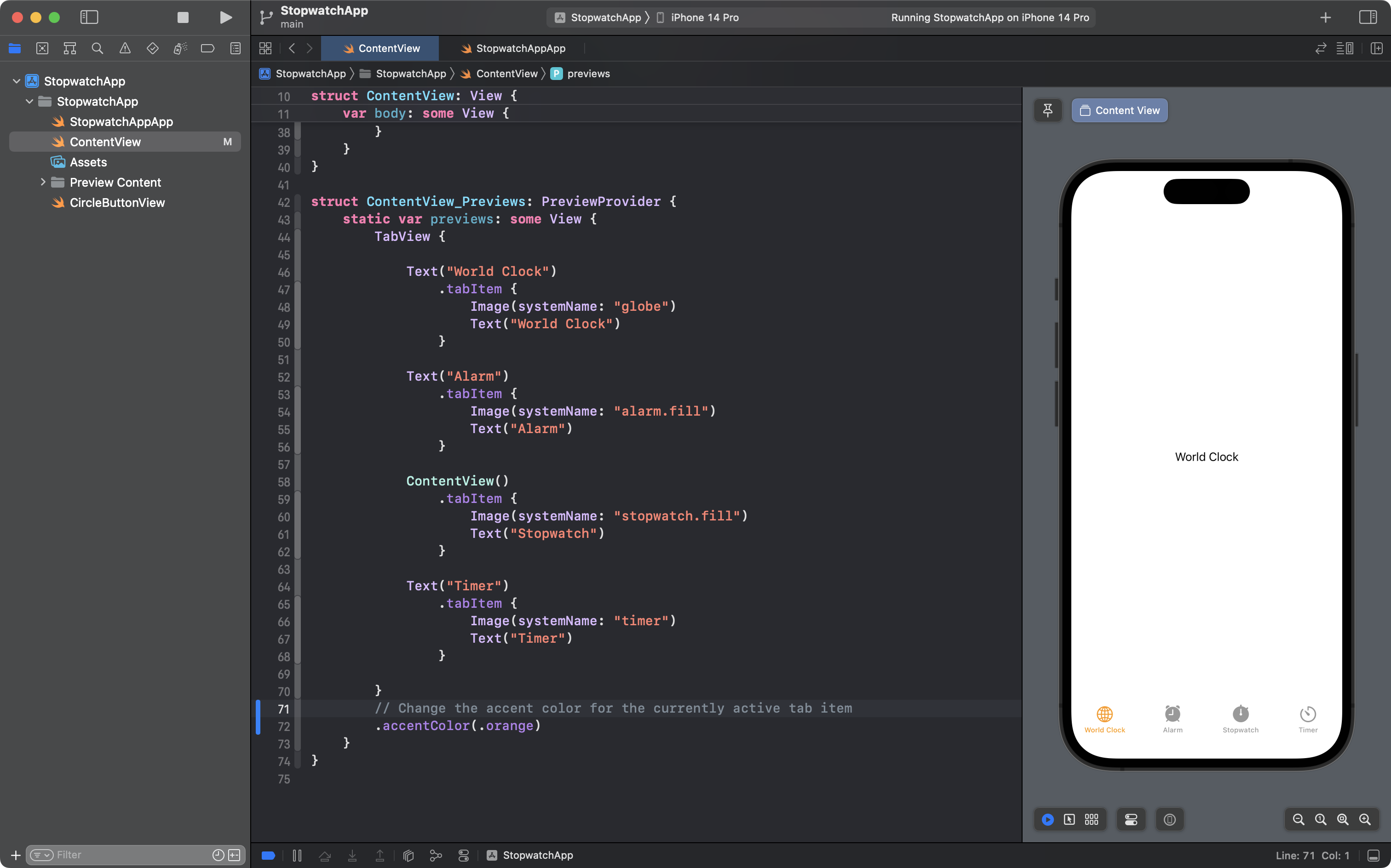
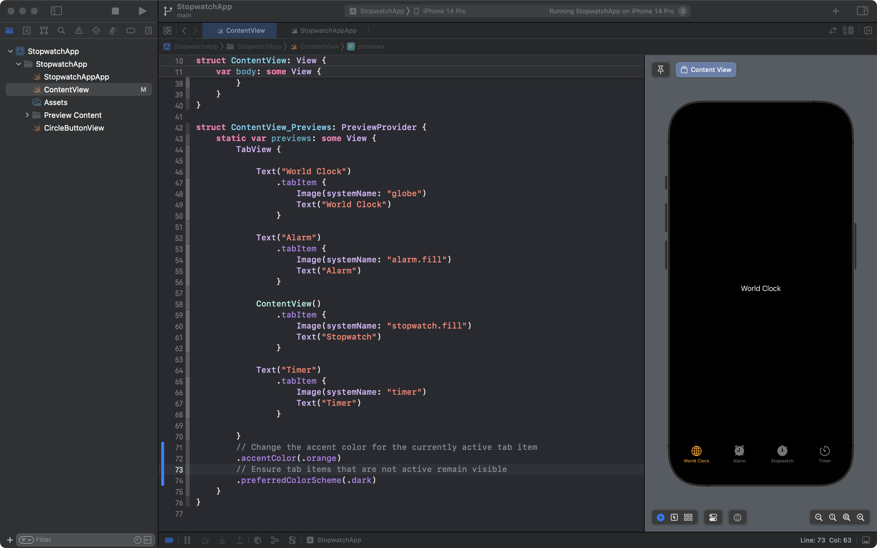
So, now, please make these edits to the ContentView_Previews structure – remember, old code is highlighted in grey, and new code is highlighted in blue:
ContentView_Previews now holds the TabView, so conceptually, this is what we have now:
flowchart TD

id1["Preview\n(TabView)"] --> id3["World Clock\n(.tabItem)"]
id1 --> id4["Alarm\n(.tabItem)"]
id1 --> id5["Stopwatch\n(.tabItem)"]
id1 --> id6["Timer\n(.tabItem)"]
Now, despite some issues to fix with colors, we've made significant progress, so please commit and push your work with this message:
Added a tab bar to the preview window for ContentView.
Before we continue, you might be wondering about the Image structures that accept a String for the systemName parameter, like this:
Image(systemName: "stopwatch.fill")
Recall that at the start of this class, you installed the SF Symbols App. You can browse available icons in the SF Symbols app. The app tells you what string, or piece of text, identifies each symbol. As shown above, to get a symbol to show in your app, you just:
- create an
Imagestructure - provide the identifying string for a symbol as the argument to the
systemNameparameter
With over 4,000 symbols to choose from in the SF Symbols app, more often than not, you'll find a symbol to suit your needs.
Next, let's fix the colour of the tab items, so the accent colour is orange.
Make this edit and note the change in color for the currently active tab item:
You can ignore the deprecation warning that might appear:
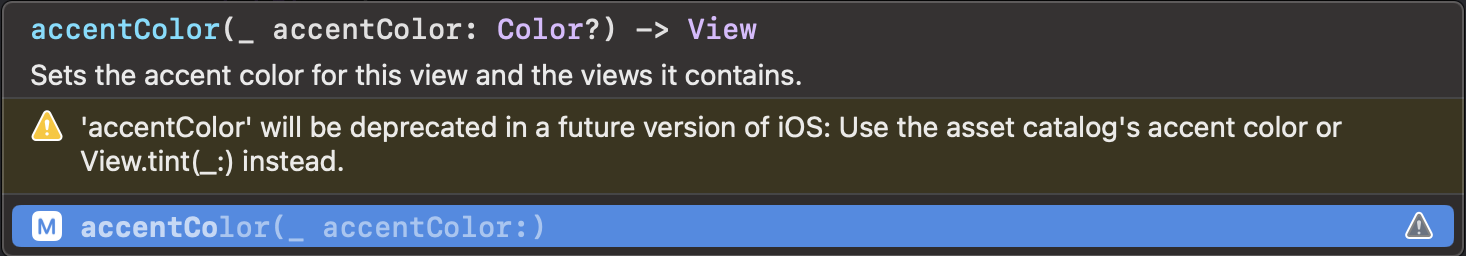
The .tint modifier should produce the same result as the .accentColor modifier, but a bug in the current version of SwiftUI means that the .tint modifier does not work in this instance.
Now as you move between tab items, you will see that the active tab item is highlighted in orange.
However, you will notice a problem when you arrive on the Stopwatch tab item that shows the interface we have been building – the other tab items are nearly invisible:
This is because we set the background color of our Stopwatch user interface to be black, always – and right now, our preview of this app thinks the device is running in Light mode.
As a result, the other tab items, when not active, adopt a shade of dark grey that is barely visible against a black background.
This, too, is easily fixed – make this edit to add the .preferredColorScheme view modifier:
Now, the preview window shows each screen in Dark mode, and the SwiftUI framework automatically uses a lighter shade of grey for inactive tab items, which makes them visible against a black background.
Although these edits are small, they are worth saving, so commit and push your work now with this message:
Made interface show in Dark mode at all times and changed accent color for active tab item.
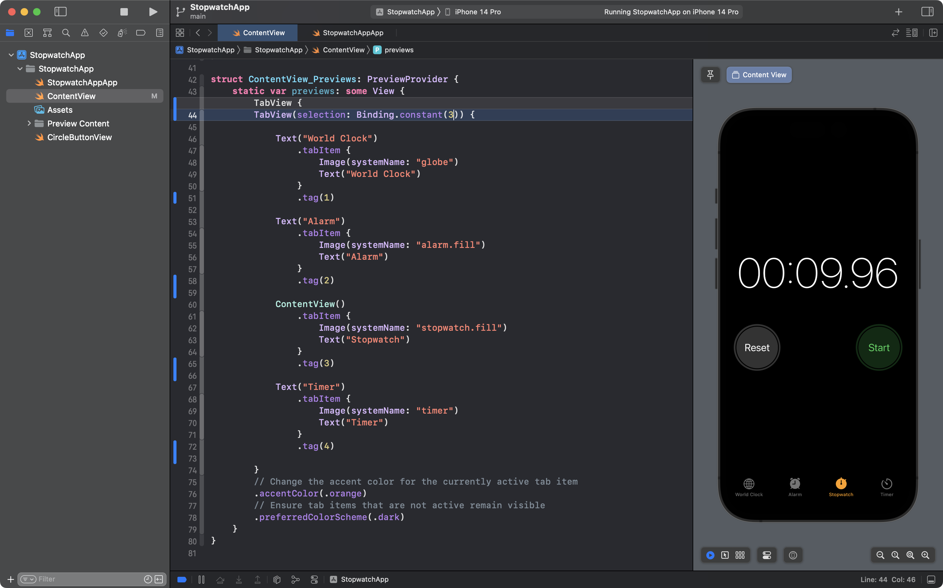
Finally, you may have noticed that the preview window always defaults to showing the first tab item.
This is a minor irritant because we are still working to add the user interface for the Stopwatch tab, which is the third tab item.
Each time we want to see our work going forward, we would have to manually tap on the third tab.
We can fix this too – by giving each tab item a tag and telling SwiftUI to default to the tab item with the tag we select – in this case, 3.
Make these edits – remember, old code is highlighted in dark grey, new code is highlighted in blue:
Now, we are all done adding the TabView.
To recap:
- we enclose the structures we want to access from a tab bar within a
TabViewstructure - we then add the
.tabItemview modifier to indicate what text and image should appear for each tab item - optionally, we can specify what the selected tab item should default to
Let's not lose this progress, so please commit and push your work with this message:
Made the selected tab item default to the Stopwatch.
Now continue with part 3 of this lesson.